First look at Executive Summary Dashboard
- 27 Oct 2023
- 1 Minute to read
First look at Executive Summary Dashboard
- Updated on 27 Oct 2023
- 1 Minute to read
Article Summary
Share feedback
Thanks for sharing your feedback!
Marketing is a data-driven discipline and marketers rely on a variety of metrics to keep track of their own effectiveness so as to fix the right marketing budget, calculate the needed resources, keep an eye on the campaign performances and measure the results against benchmarks.
What they want is a clear picture of the return on investments (ROI) to make future decisions based on a few easy-to-understand figures. However, measuring ROI is not very easy and wrong calculations are rather misleading when it comes to making decisions.
Executive Summary Dashboard will provide you the necessary data you need while incremental values will help you understand the total additional value Insider makes and you gain. Summary metrics such as conversion rate (CR) and conversion rate uplift will give you the overall performance across all of your personalizations.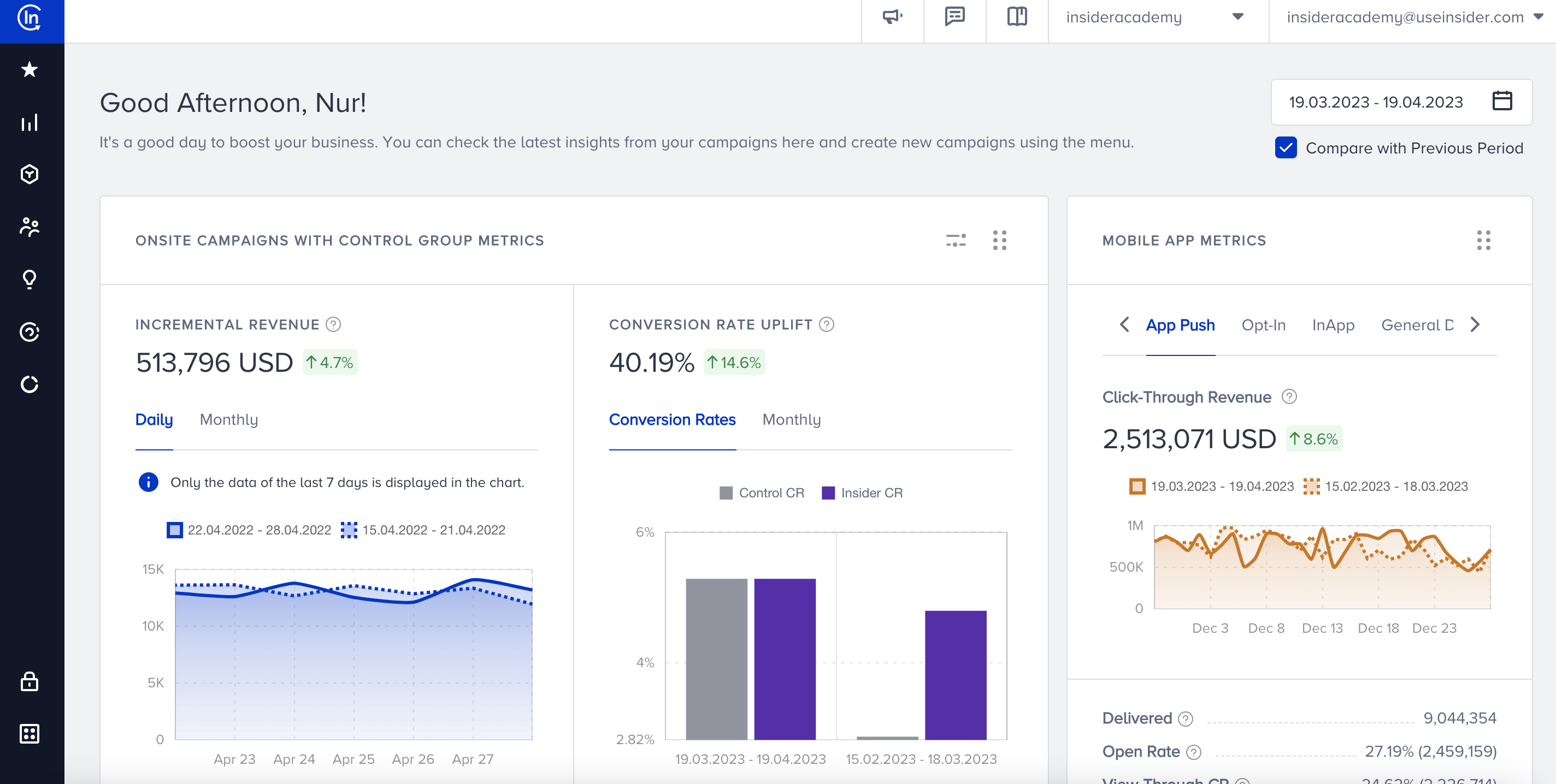
What does it offer?
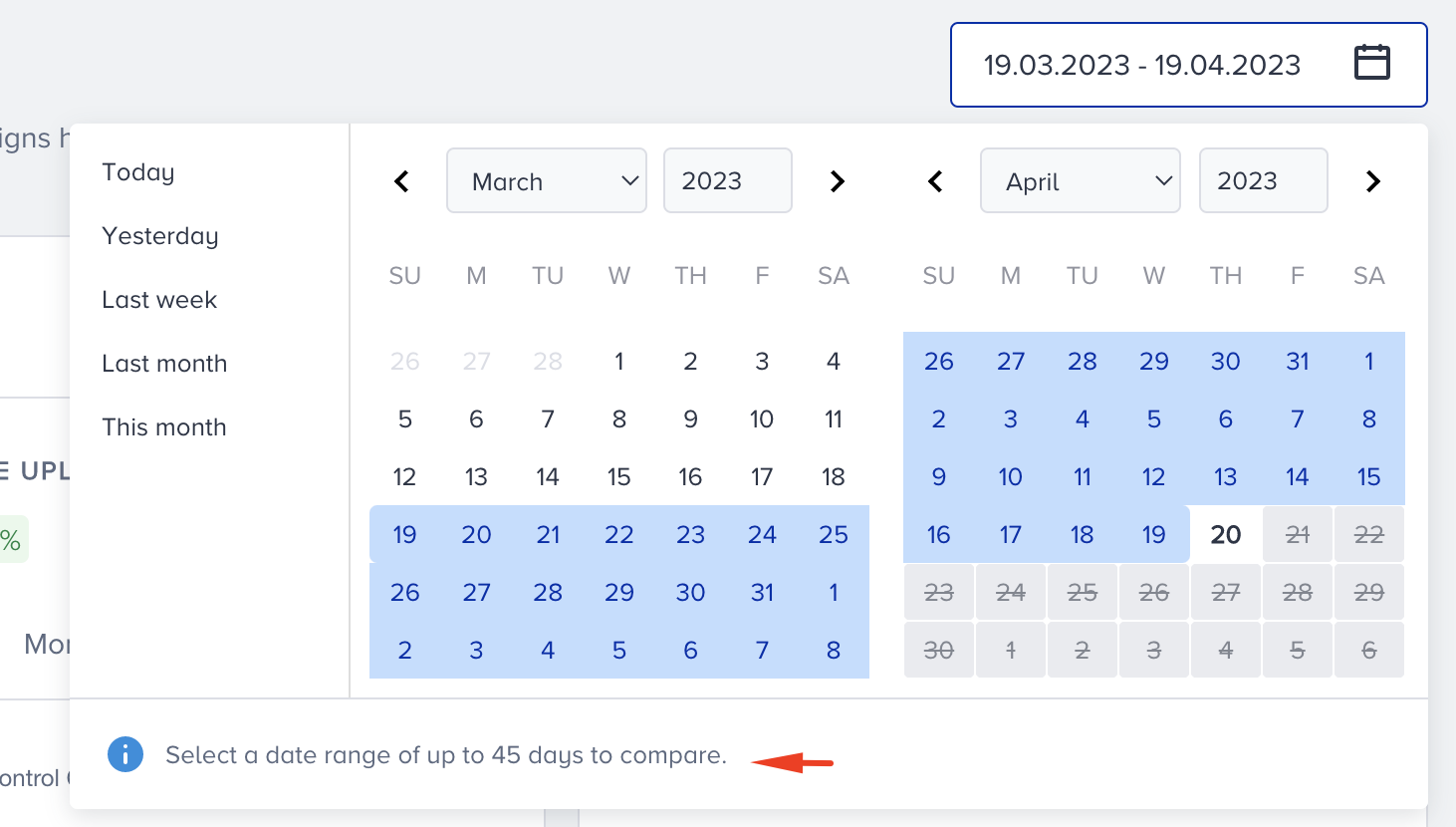
ESD allows you to compare your historical data to a previous period of the same duration.
Campaign Analytics help you see the detailed analytics of your A/B and 100% personalizations on a designated dashboard.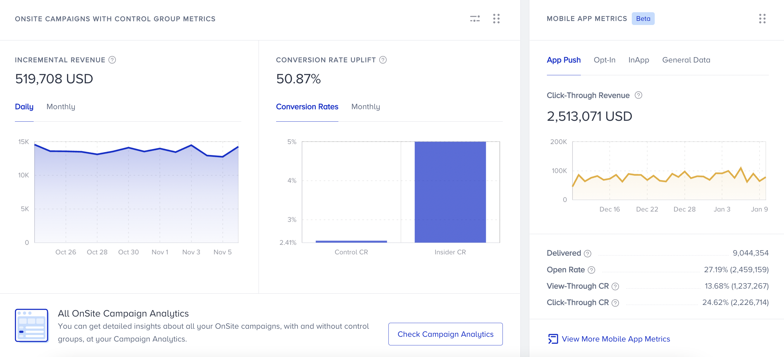
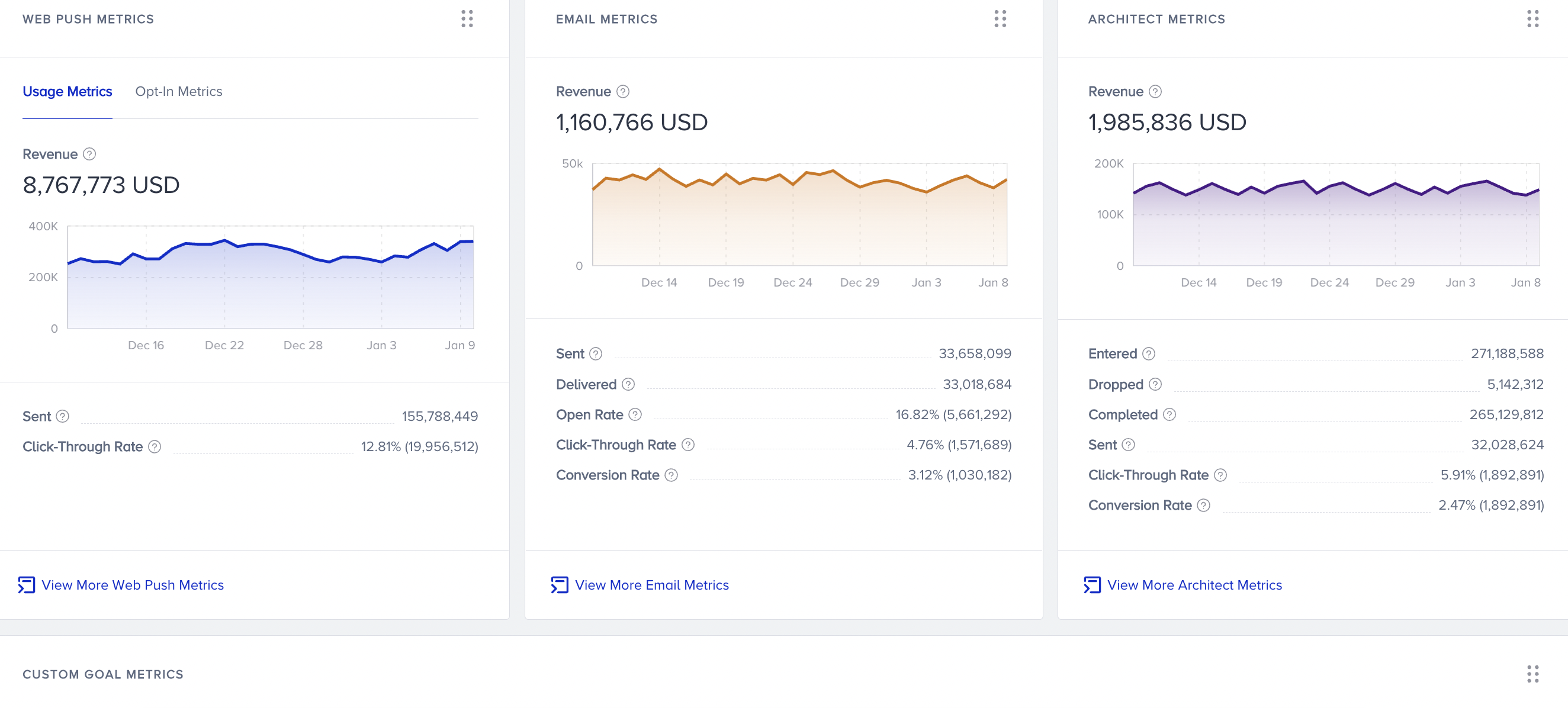 Metrics for Web Push, Email and Architect products, and custom goal metrics are displayed on the bottom of the page.
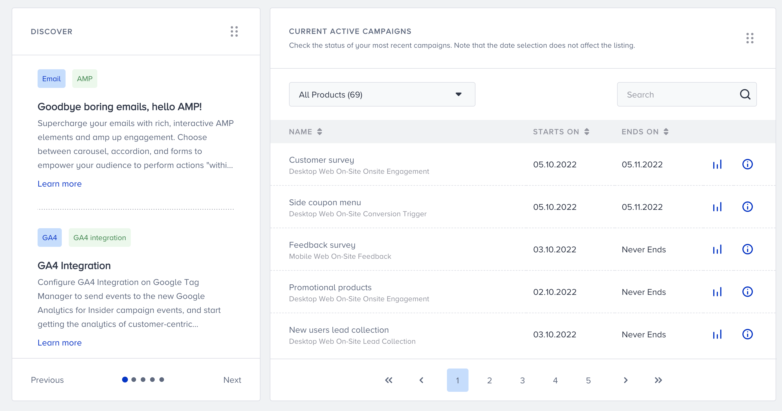
You can discover the latest developments about Insider's products, and view your currently active campaigns.
Executive Summary Dashboard offers a summary of the following channels/items and enables you to see the overall performance of your campaigns:
- OnSite Personalizations (desktop and mobile web templates)
- Web Push
- Smart Recommender
- Custom Goals (set in onsite personalizations)
Furthermore, you can see the performance of onsite personalizations on a dedicated page where the variation and control groups are comprehensively represented with incremental revenue, incremental conversions, conversion rate and conversion rate uplift.
What does it target?
Data accuracy and transparency are pillars when it comes to Return on Investment for which Executive Summary Dashboard has been built indeed.
This dashboard aims to increase the data transparency for you to see the details when inspecting the performance of your personalizations and to offer accurate data, hence understanding the performance at a glance.
What are the key features?
Executive Summary Dashboard enables you to narrow your results down, export them and see your personalizations based on their being A/B testings or not through the following:
- Filters
- Independent pages for On-Site Campaigns with and without Control Groups
Was this article helpful?