Anatomy of Responsive Web Suite
- 09 May 2024
- 9 Minutes to read
Anatomy of Responsive Web Suite
- Updated on 09 May 2024
- 9 Minutes to read
Article Summary
Share feedback
Thanks for sharing your feedback!
Responsive Suite provides you with easy-to-use templates and helps you design the content for all platforms within the same campaign.
Your title goes here
The minimum supported screen size for responsive templates is 1200 pixels.
This article covers the topics below to better understand the Responsive Templates:
- How to create it
- The Preview tab
- Size and Position
- The Design tab
- Template structure
- Layout settings
- Element settings
- Zoom In - Zoom Out
How to create it
To start configuration, select the template on the Template Store and you will land on the Action Builder page. 
Since Responsive Templates enable you to design all the platforms at once, you can find the platform selections in the Action Builder. You can change the platform to preview or design the template.
The Preview tab
On the top banner of this page, you can see Size, Position, Navigate Mode options, and platform icons that you can switch between them to see how your campaign looks on each platform.
- Navigate Mode helps you navigate through your web pages to place your campaign.
- Size menu helps you to set the width and height of the template.
- Position menu helps you to place your on-page campaign anywhere you want on the website. You can select any other place via default placement options or give margins.


Size and Position
Depending on the template type (on page or inline) the options are visible to set the size of the template and positioning on the screen.
For example, on-page templates have the Size option. You can set the width/height under this option in the Preview tab. It can be either percentage(%) or pixel (px) values. 
Also, it turns into Auto mode if you do not set any values here. Then, it takes the size information (height) from the design.
If you want to make a full page banner, you can set the width to 100% and the height to 100%.
The Design tab
You can start designing your on-page responsive template on the Design tab. Follow the steps below to start designing:
1. When Sync All Platforms is on, all the changes you make will apply to Mobile, Tablet, and Desktop platforms instantly. Therefore, you can select the platform to which all platforms will be synchronized as well. Switching between platform icons right next to Sync All Platforms toggle, you can see how your template looks on each. Only the layout selections won’t apply to all platforms even when sync is on as a rule.
If you choose to make separate changes in different platforms, you can switch the sync toggle off. 
2. Advanced Settings on the top bar allows you to add custom CSS for a change on site or run custom JavaScript on the website. 
3. You can find the same menu for resizing the template in the Design tab. Thanks to it, you can change the width and height values in pixels or percentages of the layouts. Additionally, if the Auto-fit option is set to Height, the template's height will automatically adjust itself when elements are added or removed.
Your title goes here
The size values are synchronized between the Design and Preview tabs. So any changes made in the Preview tab will also be reflected in the Design tab and vice versa.

Pulling indicators, you can also resize the template in the canvas directly. Four new indicators help you change the width and height of the template. You only need to pull indicators, then the size values will be calculated accordingly. You can check the size values while hovering over the indicators or in the Size menu. 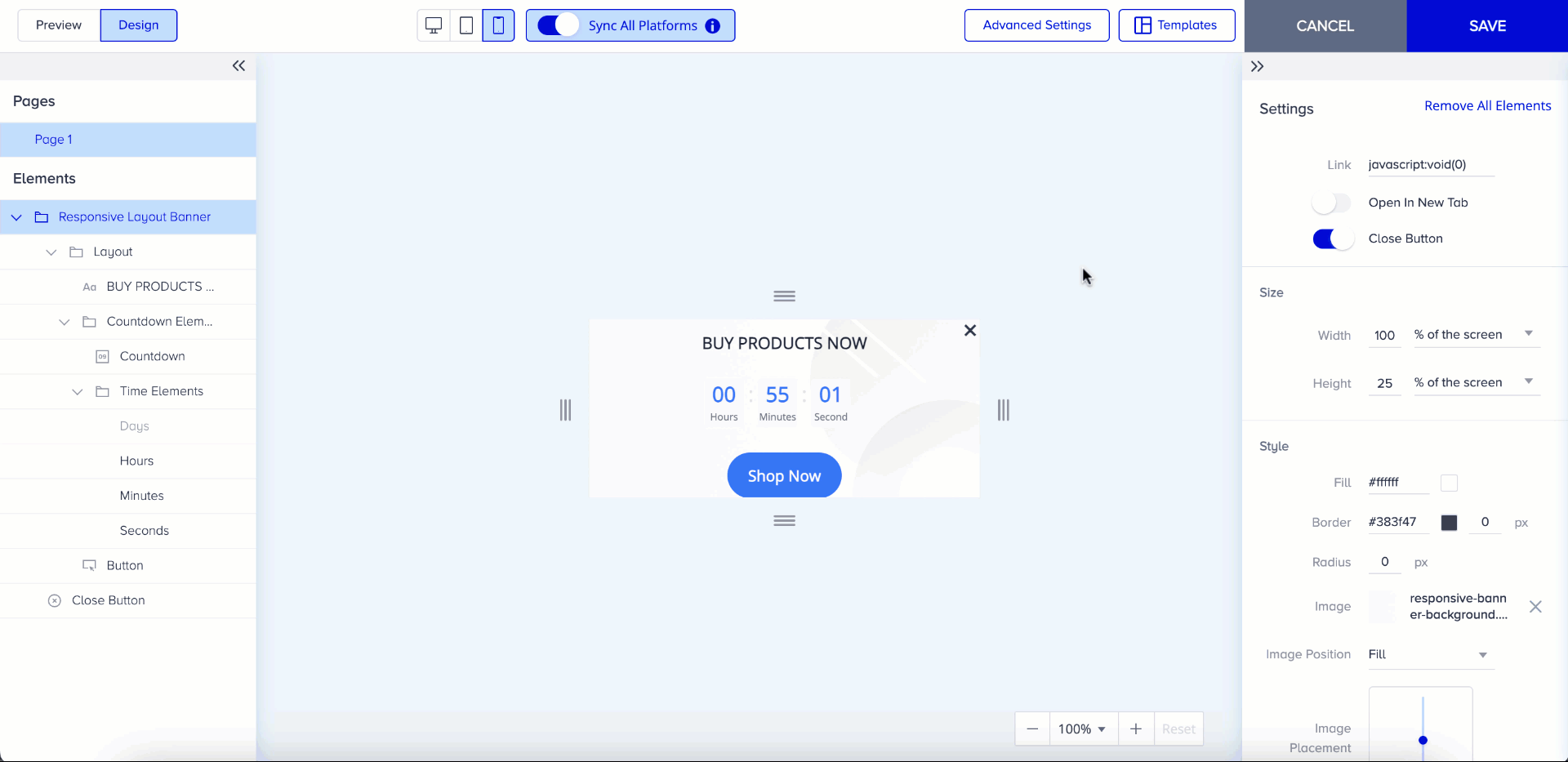
If the template content does not fit into the template size, the content can be visible when you select the indicator.
4. You can choose from several layout selections based on your use case. Each layout is a wireframe that contains a specific arrangement of elements. 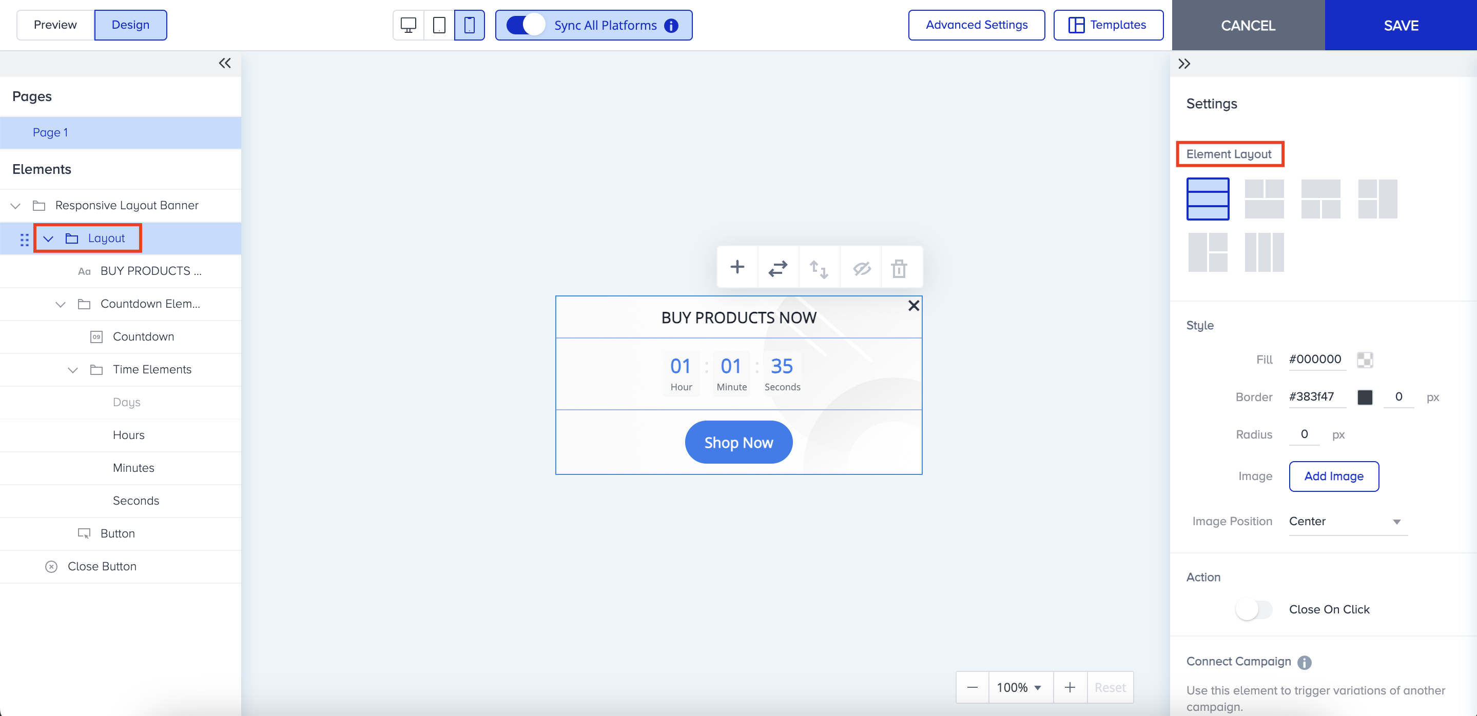
When you hover over the layout and click the plus (+) button, you can add the layout to the selected area. Note that you can add as much as layout as you want; there is no limit. 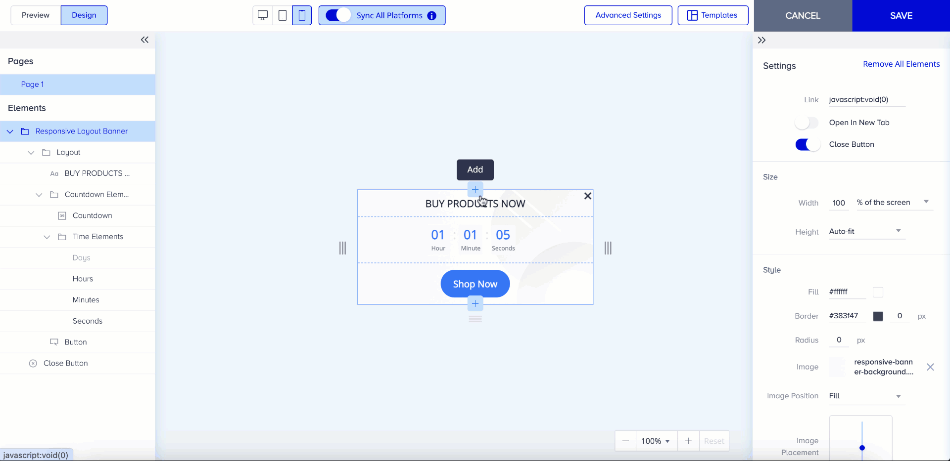
You can also change the layout structure via the element layout menu on the right side of the screen or on the layout itself when hovered. 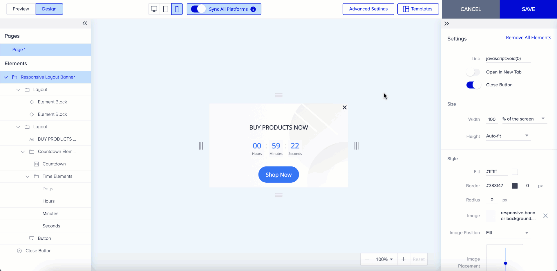
You can also hide layouts when you have more than one layout on your template. 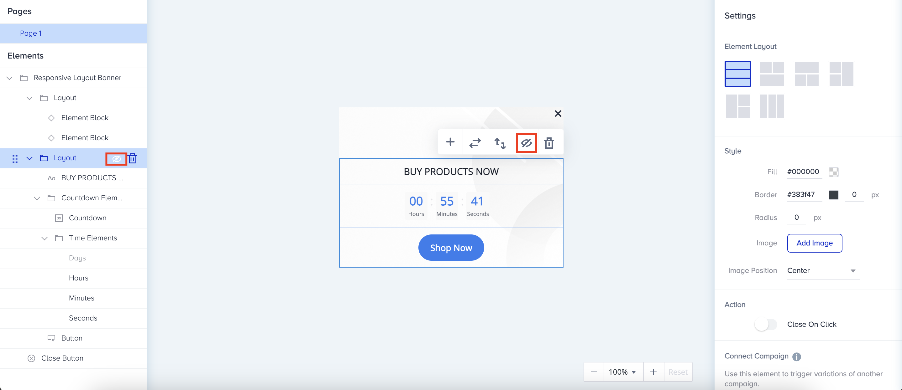
5. When you hover on the layout, plus (+) buttons appear and you can add an element or a layout to your canvas. Additionally, when you click on the canvas, you see a menu appears where you can add an element or change the layout. You can also change the layout on the right panel of the Action Builder. .gif)
6. Once you click on one element, you can see the options to change the element, switch the order, and delete it. In addition, on the right menu of the Action Builder, you will see the element options, element alignment, text settings, link addition, connect another campaign functions, or further features like spacing, size, and advanced borders. You can add elements such as text, image, button, coupon code, and countdown for this template. Specifically for the image element, you can configure its settings on the right menu. You can also change elements on the canvas via the menu displayed below or via the elements dropdown menu on the right menu.
Your title goes here
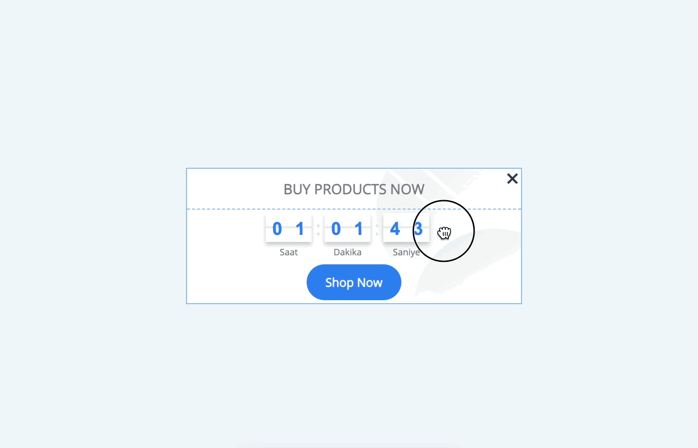
Countdown elements have time labels such as Day, Hour, Min, and Seconds. The text of these labels is dynamically translated based on the selected language in the Launch step. For instance, if you choose English, the campaign displays x hours, y minutes, or z seconds to users on your website.
.gif)
7. You can switch the order of the elements with the previous or next in the template. .gif)
8. You can delete elements directly on canvas or via the left menu till only one of them remains on the canvas. 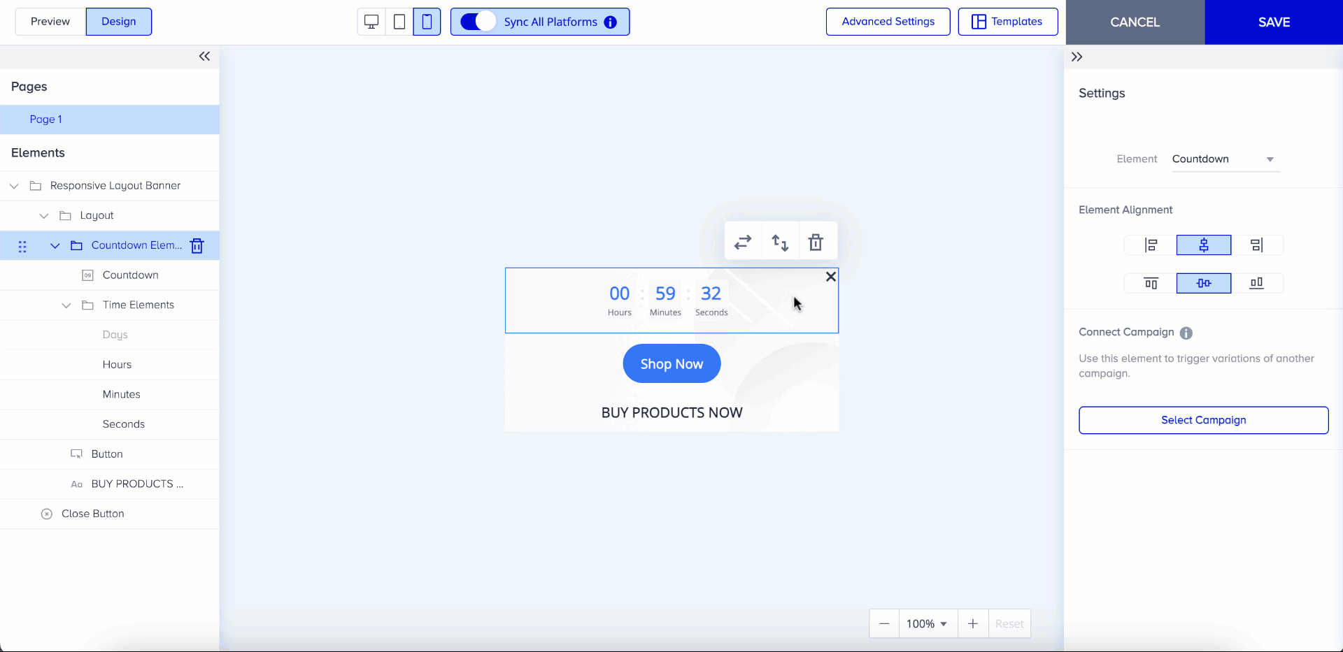
9. You can drag and drop to move elements inside the layout on the left menu. 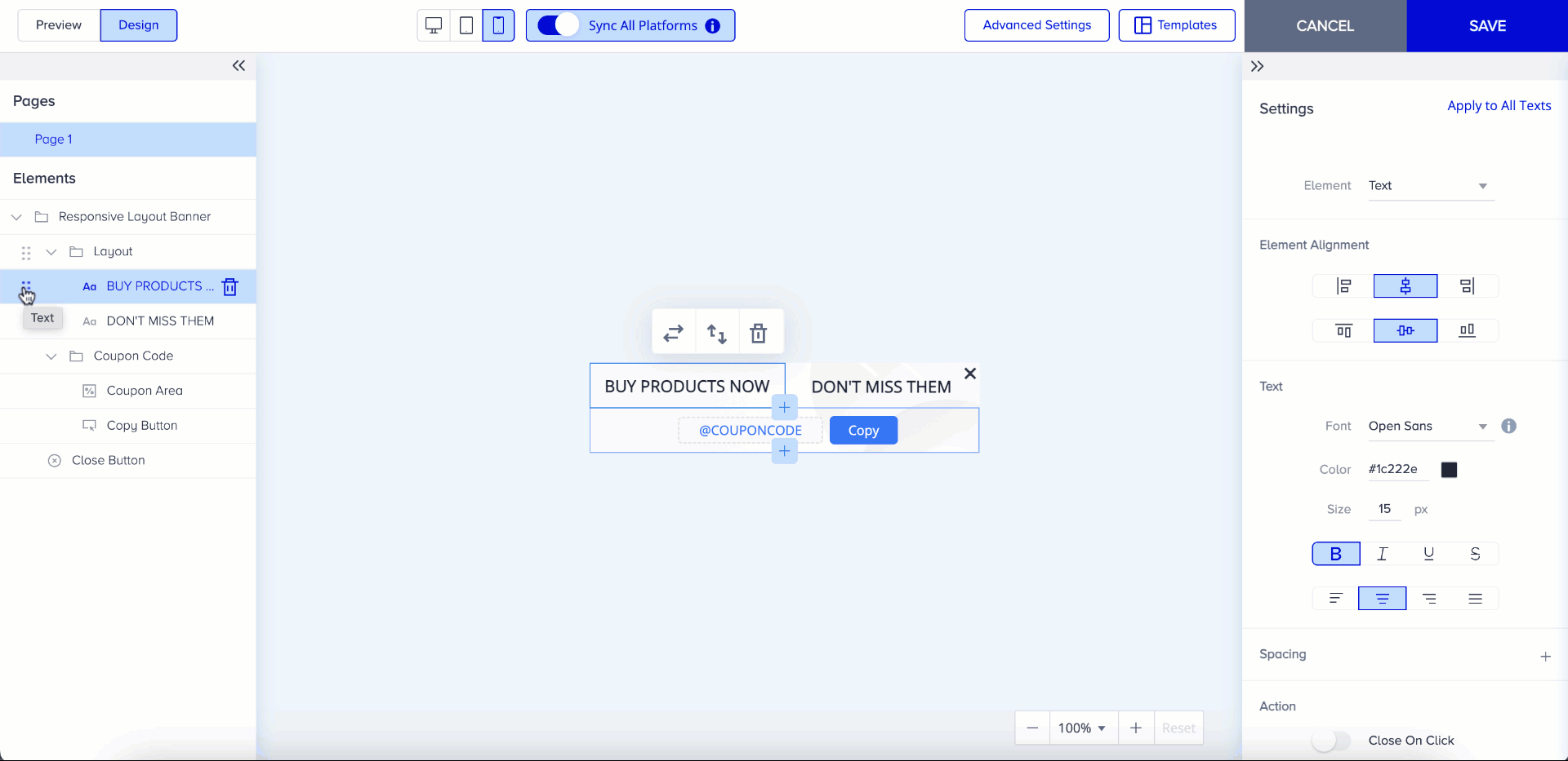
10. You can drag and drop to change the element’s width or height. The size of the layout’s height will change according to the area it is in. 
11. You can use icons on the top bar to see how your template looks on the other platforms.
After finalizing your design, click the Preview tab on the Action Builder to preview it on your website. Here, you can still change its size or position. .gif)
Template structure
Template Structure enables you to organize layouts and elements into sections effortlessly and you can utilize more advanced design capabilities with it. Template Structure is available for all Responsive templates except for Social Proof. You can find this feature under the Settings menu.

You have the option to add a second section with the layouts in the Template Structure. Depending on your preference, both horizontal and vertical layouts are available. All elements from the first layout or the first individual element are placed in the first section, while everything else is allocated to the second section of the design. You can adjust the layout direction of your structure through the Settings menu on the right or you can drag the sections in the left menu.
You can also drag the sections to change the proportion between the sections or you use the slider. 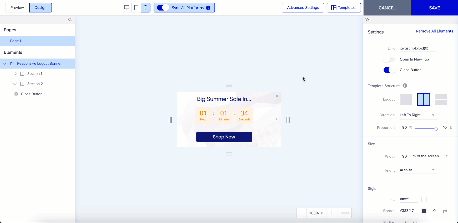
When you turn the sync on and add a section to one platform, it will also be added to other platforms. The order of elements/layouts inside the section will also sync with all platforms. However, changes you make in the layout structure will not be applied to other platforms. For example, if you choose a horizontal layout structure, it will not be synced with other platforms since mobile may have a vertical structure while desktop may have a horizontal structure when sync is on. Direction and proportion settings are also not synchronized with the other platforms, allowing you to easily customize and differentiate your designs.
The experience of adding a new element or layout is the same for the Template Structure. You can add an element/layout via the Add Element menu. 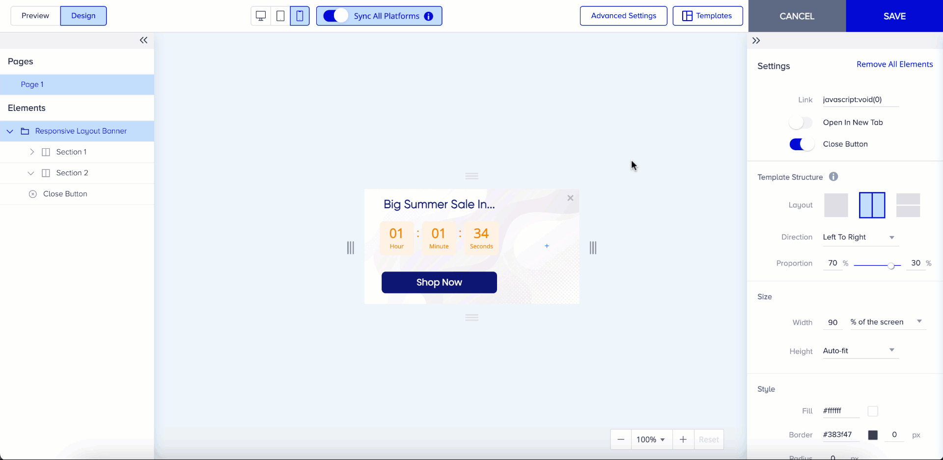
Layout settings
Responsive templates consist of elements and layouts to help you design your content with elements and layouts.
Layout is a combination of up to 4 elements and you can create 2 to 4 element layouts. Once you add a new layout to the template, you will see an empty element block and you can click the plus (+) button to add any element you want to include.
Different combinations are available in Element Layout. You can select one of them according to how you want to position the elements.

- To add a layout, hover your cursor under the layout and click the plus (+) button. You can see adding layout and element count selection area.
- After selection, click the Add button. You can add a new layout and see it on the left menu.
Your title goes here
You can add as many layouts as you need; there are no limits.
You can change the layout structure of your layout settings.

Element settings
Besides the layouts, you can add individual elements to the template. Different types of elements are available based on the selected responsive template.
Your title goes here
You can add Countdown and Coupon code elements only once.
- You can change elements via shortcuts located on the top of the elements or the left menu. Similarly, you can change their order via the shortcuts or use the drag-and-drop method on the right menu.

- You can hide the elements to not show them, and unhide them when you want to use them. To hide the element, click on it on your canvas and click the eye icon. You can click the eye icon again to unhide the element.
- You can drag and drop to change the element width and height. The size of the layout will change according to the area it is located.


Template resizing (only for on-page templates)
In the Design tab, you can resize your on-page template in the same menu. In this menu, you can change the width and height values in pixels or percentages of the layouts. Additionally, if the Auto-fit option is set to Height, the template's height will automatically adjust itself when you add or remove elements.
Your title goes here
It is important that the size values are synchronized between the Design and Preview tabs. So any changes made in the Preview tab will also be reflected in the Design tab and vice versa.
Moreover, you can directly pull the indicators to resize templates in the canvas. Four new indicators help you change the width and height of the template. You only need to pull indicators, then the size values will be calculated accordingly. You can check the size values while hovering over the indicators or in the Size menu.
If the template content does not fit into the template size, the content can be visible when you select the indicator. 
Zoom In - Zoom Out
Zooming provides you with more convenient use while preparing your template. When you click “-”, it reduces the size of the template while clicking “+” increases its size. The reset button returns you to 100%.
Your title goes here
You can zoom out 50% minimum and zoom in 200% maximum.

Once your design is ready, you can proceed with the rest of your campaign.
Was this article helpful?